Time Series Forecast: Predicting Daily Sales for Walmart
Problem exposition and Business Value
Walmart has Weekly Sales data spanning almost 3 years for 45 of its stores in the US.
I have been tasked to come up with a method to forecast its sales. These predictions, if accurate and reliable, will be extremely useful to Walmart for several reasons:
-
Operations & Inventory Optimization: Predicting daily sales enables Walmart to streamline its operations by optimizing inventory management. Accurate sales forecasts help ensure that the right products are stocked at the right locations, reducing excess inventory and minimizing stockouts. Additionally, these predictions can help Walmart optimize staffing levels, aligning workforce availability with customer traffic and demand, which ensures that stores are adequately staffed during peak times while minimizing labor costs during slower periods.
-
Enhanced Customer Experience & Service: Sales predictions are key to providing a smoother, more reliable customer experience. By anticipating demand trends, Walmart can ensure that high-demand products are always available, avoiding the frustration of out-of-stock items and thereby improving customer satisfaction. Additionally, this insight allows for more personalized promotions and marketing efforts, targeting customers with relevant offers based on anticipated purchasing trends.
-
Supply Chain Efficiency & Cost Reduction: Predicting daily sales helps Walmart manage its supply chain more effectively by reducing lead times and enabling just-in-time inventory practices. With better forecasts, the company can coordinate with suppliers to avoid last-minute rush orders, reducing shipping costs and improving product availability. Moreover, sales predictions support more accurate production scheduling for Walmart’s suppliers, fostering a more efficient and responsive supply chain.
1) Imports and set-up
import numpy as np
import pandas as pd
import matplotlib.pyplot as plt

from sklearn.metrics import mean_squared_error
from scipy.stats import boxcox
from statsmodels.tsa.stattools import adfuller
from statsmodels.tsa.arima.model import ARIMA

from statsmodels.graphics.gofplots import qqplot
from statsmodels.graphics.tsaplots import plot_acf
from statsmodels.graphics.tsaplots import plot_pacf

plt.style.use('fivethirtyeight')
2) Load Dataset
# load dataset

df = pd.read_csv('path_to_data/walmart-sales-dataset-of-45stores.csv')
3) EDA and Data Cleaning
Let’s take a look at the data to understand it better
# explore
df
| Store | Date | Weekly_Sales | Holiday_Flag | Temperature | Fuel_Price | CPI | Unemployment | |
|---|---|---|---|---|---|---|---|---|
| 0 | 1 | 05-02-2010 | 1643690.90 | 0 | 42.31 | 2.572 | 211.096358 | 8.106 |
| 1 | 1 | 12-02-2010 | 1641957.44 | 1 | 38.51 | 2.548 | 211.242170 | 8.106 |
| 2 | 1 | 19-02-2010 | 1611968.17 | 0 | 39.93 | 2.514 | 211.289143 | 8.106 |
| 3 | 1 | 26-02-2010 | 1409727.59 | 0 | 46.63 | 2.561 | 211.319643 | 8.106 |
| 4 | 1 | 05-03-2010 | 1554806.68 | 0 | 46.50 | 2.625 | 211.350143 | 8.106 |
| ... | ... | ... | ... | ... | ... | ... | ... | ... |
| 6430 | 45 | 28-09-2012 | 713173.95 | 0 | 64.88 | 3.997 | 192.013558 | 8.684 |
| 6431 | 45 | 05-10-2012 | 733455.07 | 0 | 64.89 | 3.985 | 192.170412 | 8.667 |
| 6432 | 45 | 12-10-2012 | 734464.36 | 0 | 54.47 | 4.000 | 192.327265 | 8.667 |
| 6433 | 45 | 19-10-2012 | 718125.53 | 0 | 56.47 | 3.969 | 192.330854 | 8.667 |
| 6434 | 45 | 26-10-2012 | 760281.43 | 0 | 58.85 | 3.882 | 192.308899 | 8.667 |
6435 rows × 8 columns
The data looks as expected. Let’s call the .describe() method to understand the distribution of the different columns and see if there are any missing values
df.describe()
| Store | Weekly_Sales | Holiday_Flag | Temperature | Fuel_Price | CPI | Unemployment | |
|---|---|---|---|---|---|---|---|
| count | 6435.000000 | 6.435000e+03 | 6435.000000 | 6435.000000 | 6435.000000 | 6435.000000 | 6435.000000 |
| mean | 23.000000 | 1.046965e+06 | 0.069930 | 60.663782 | 3.358607 | 171.578394 | 7.999151 |
| std | 12.988182 | 5.643666e+05 | 0.255049 | 18.444933 | 0.459020 | 39.356712 | 1.875885 |
| min | 1.000000 | 2.099862e+05 | 0.000000 | -2.060000 | 2.472000 | 126.064000 | 3.879000 |
| 25% | 12.000000 | 5.533501e+05 | 0.000000 | 47.460000 | 2.933000 | 131.735000 | 6.891000 |
| 50% | 23.000000 | 9.607460e+05 | 0.000000 | 62.670000 | 3.445000 | 182.616521 | 7.874000 |
| 75% | 34.000000 | 1.420159e+06 | 0.000000 | 74.940000 | 3.735000 | 212.743293 | 8.622000 |
| max | 45.000000 | 3.818686e+06 | 1.000000 | 100.140000 | 4.468000 | 227.232807 | 14.313000 |
df.isnull().sum()
Store           0
Date            0
Weekly_Sales    0
Holiday_Flag    0
Temperature     0
Fuel_Price      0
CPI             0
Unemployment    0
dtype: int64
print(df.Date.min())
print(df.Date.max())
01-04-2011
31-12-2010
df.Date.value_counts()
05-02-2010    45
23-12-2011    45
11-11-2011    45
18-11-2011    45
25-11-2011    45
02-12-2011    45
09-12-2011    45
16-12-2011    45
30-12-2011    45
28-10-2011    45
06-01-2012    45
13-01-2012    45
20-01-2012    45
.
.
.
31-12-2010    45
07-01-2011    45
14-01-2011    45
21-01-2011    45
28-01-2011    45
26-10-2012    45
Name: Date, dtype: int64
Everything looks to be in order. There are no missing values. Each store has 45 data points, as does each date. Something to note is that standard deviation of the Sales metric is quite high.
4) Problem Framing + Data Wrangling & Resampling
We need to do a little work to better frame the problem. I had originally wanted to use a single store to predict weekly sales for, but this number of data points is quite small (45).
The alternative is to combine several stores data at the date level by summing weekly sales. This will solve the problem of not having enough data, but it will probably introduce spurious variables into the dataset.
In other words, there could be differences inherent to the stores I would be combining, such as one store being located in the Downtown part of a major city while the other is in a more rural location, which could impact their sales. I won’t be able to capture this in my model and this will likely introduce errors.
One way to overcome this problem is to combine data for stores that exhibit similar levels of sales, so let’s try doing just that
df.sort_values(by = ['Store', 'Date'], inplace = True)
sales_line_plot_df = df[['Store', 'Date', 'Weekly_Sales']]

sales_line_plot_df = sales_line_plot_df.groupby(['Store', 'Date'])['Weekly_Sales'].max()
sales_line_plot_df = sales_line_plot_df.unstack(level = ['Store'])

# take the first 20 stores as a sample
sales_line_plot_df_sample_20 = sales_line_plot_df.iloc[:, :20]
sales_line_plot_df_sample_20.plot(figsize = (12, 10))
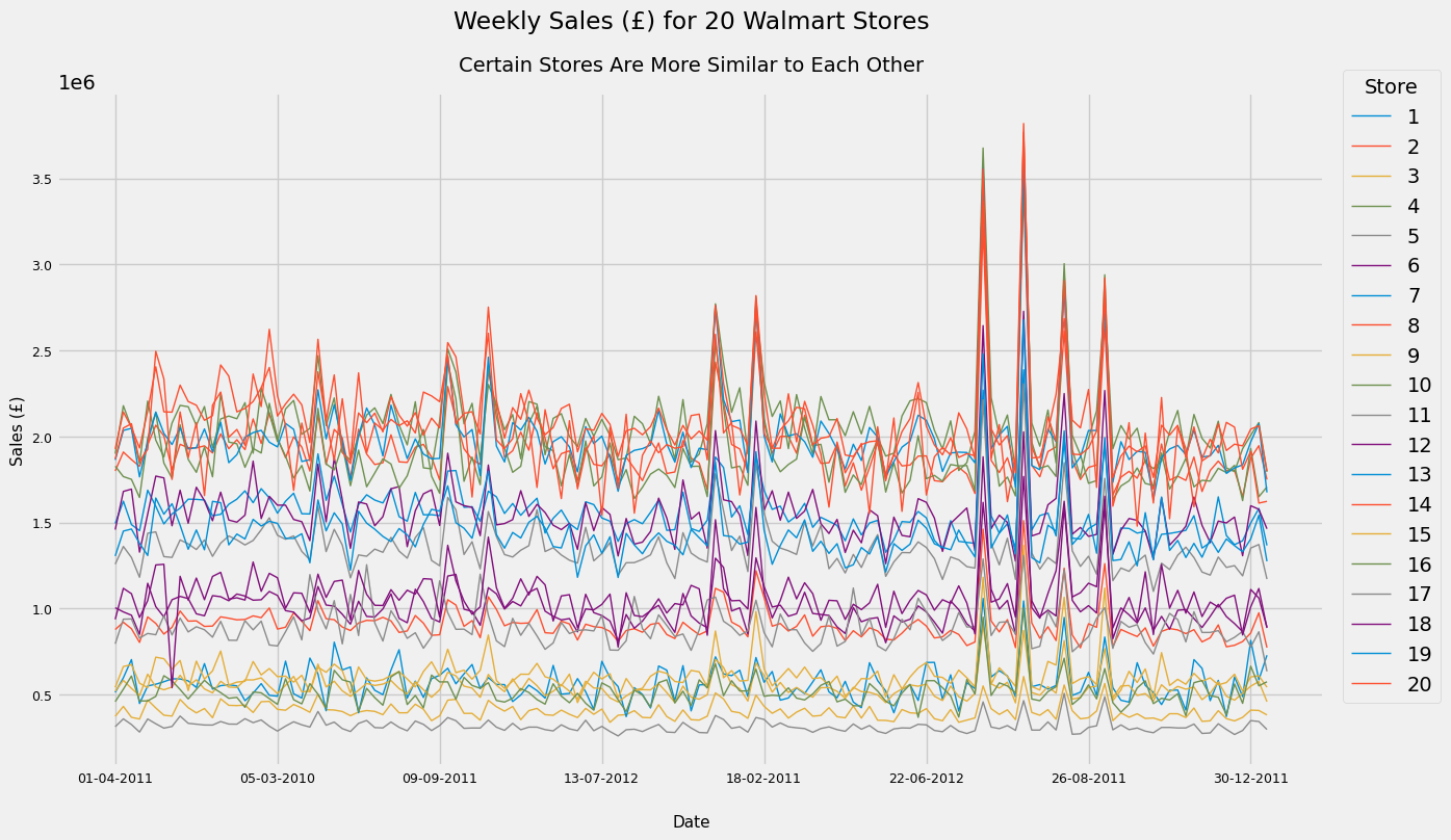
A very messy graph but it serves our purpose - we can clearly see that there are clusters of stores with similar volumes of Weekly Sales. It looks like Stores 8, 12, 17 and 18 are clustered together. Let’s see if this is indeed the case. (I also looked at the stores 35 and 40 and added these to the below graph as they have a similar volume of sales)
sales_line_plot_df.loc[:, [8, 12, 17, 18, 35, 40]].plot(figsize = (12, 10))
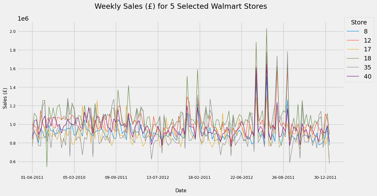
Nice. Let’s go ahead and create a new dataframe with only our required stores for which we’ll combine sales at each given Date. These Date values are thankfully consistent across stores, allowing an easy merge.
df_selected_stores = df[df.Store.isin([8, 12, 17, 18, 35, 40])]
df_selected_stores = df_selected_stores.groupby('Date')['Weekly_Sales'].sum().to_frame()

# set the date type of the dataframe to datetime for further processing and sort it
df_selected_stores.index = pd.to_datetime(df_selected_stores.index)
df_selected_stores.sort_index(inplace = True)
Let’s do an additional check on the combined “weekly” data for our 5 stores
df_selected_stores.plot(kind = 'line', figsize = (10, 8))
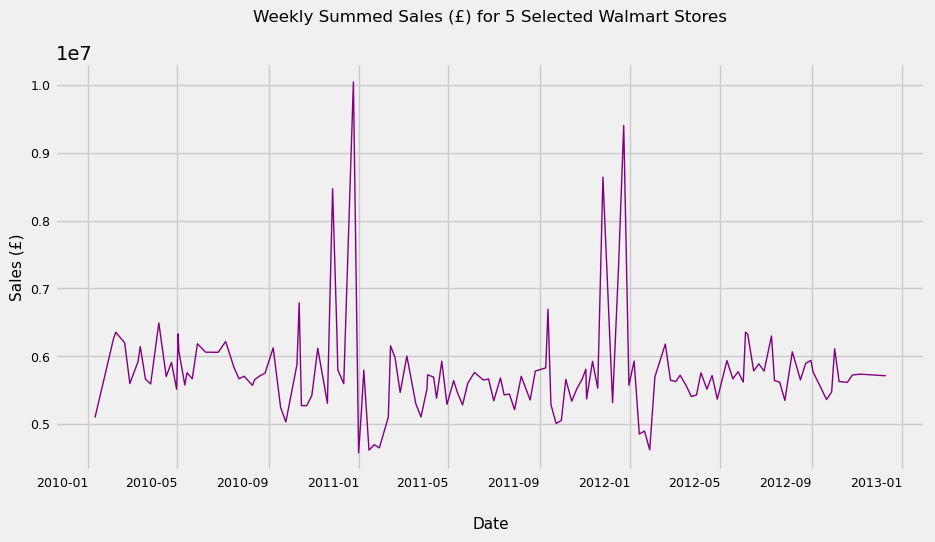
Great! It looks like we have chosen stores with similar levels of sales. Next we need to think about the granularity of the data we want to be working with. The data in its current format, while consistent across Stores, are ultimately erratic and don’t follow any real pattern (see below). This means we need to conduct resampling
pd.Series(df_selected_stores.index.unique())
0     2010-01-10
1     2010-02-04
2     2010-02-07
3     2010-02-19
4     2010-02-26
5     2010-03-09
6     2010-03-12
7     2010-03-19
8     2010-03-26
9     2010-04-06
10    2010-04-16
11    2010-04-23
12    2010-04-30
13    2010-05-02
.
.
.
138   2012-10-08
139   2012-10-19
140   2012-10-26
141   2012-11-05
142   2012-12-10
Name: Date, dtype: datetime64[ns]
We have a few options when it comes to choosing post-resampling granularity. We can manipulate our dataset to show daily, weekly, monthly or even quarterly data. However, it seems reasonable that a supermarkets sales follow a daily cycle - many customers shop on the weekend, for example. As a result, I will upsample to Daily data and interpolate views between existing data points using a quadratic function.
I chose a quadratic function instead of a linear one because it looks more natural visually. In any case, if our model’s performance is poor on this view, we can always try a linear interpolation or even a weekly/monthly framing of the problem.
upsampled_df_selected_stores = df_selected_stores.resample('D')
upsampled_df_selected_stores = upsampled_df_selected_stores.interpolate(method = 'spline', order = 2)

# rename column to reflect new granularity
upsampled_df_selected_stores.rename({'Weekly_Sales':'Daily Sales'}, axis = 1, inplace = True)
upsampled_df_selected_stores.plot()
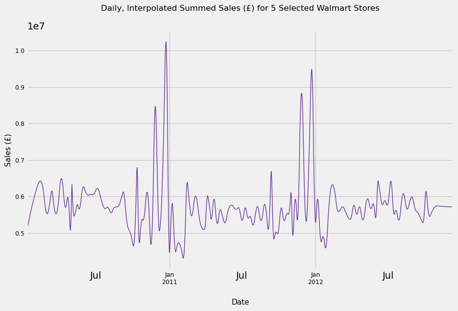
This looks reasonable. We have at least 4 outliers in sales, all of which occur December across both years. The most likely explanations for these are Christmas and New Year’s. We also see a slump in the first few days of January. Finally, the data seems to be trend-stationary. While the graph shows what looks to be a seasonal component to the data, it is merely only cyclical data. To be classed as seasonality, cycles need to be repeated at the same frequency, a condition our graph clearly does not meet.
We will return to this in a moment as first, as we have more pressing concerns to deal with first. Namely, we need to have a baseline performance to compare our eventual model and predictions to.
5) Dataset Splitting & Naive/Persistence Forecast
In time series problems, a persistence or naive forecast uses obs(t-1) as a prediction for obs(t). It then compares each prediction against each observed value and summarises the skill of the model using the root mean squared error (RMSE) measure.
To perform this, we split the data 3 ways - training, validation and test. The validation set will be used to see how well our initial trained model performs while the test set will be used as a final “blind” check to see whether our model truly has the skill at predicting sales that we may think it has. The dataset splits are as follows: 60% for training, 20% for validation and 20% for test.
Coming back to the Naive forecast, we will walk forward over the validation set, adding each ‘new’ observation seen to our training set, and using that as the prediction for the next time stamp.
# X = upsampled_df_selected_stores['Daily Sales'].values

train_and_valid_size = int(len(X)*0.80) # 80% of entire dataset
dataset = X[:train_and_valid_size]
test = X[train_and_valid_size:]

train_size = int(len(dataset)*0.75) # 75% of 80% = 60% of entire dataset
train = dataset[:train_size] # 20%
validation = dataset[train_size:] # 20%

print('Train Size:', len(train))
print('Validation Size:', len(validation))
print('Test Size:', len(test))

history = [x for x in train]
predictions = []

for i in range(len(validation)):
    yhat = history[-1] # the very last observation seen in 'history'
    predictions.append(yhat)
    latest_observation = validation[i]  # add the value we have just seen to 'history'
    history.append(latest_observation)


# find RMSE
rmse = np.sqrt(mean_squared_error(validation, predictions))
print('RMSE for Persistence Model is £%.2f in Sales per Day' % rmse)

plt.figure(figsize = (12, 5))
plt.plot([x for x in validation],
          linewidth = 1,
          color = 'crimson',
          label = 'Actual')
plt.plot([x for x in predictions],
          linewidth = 1,
          color = 'cadetblue',
          linestyle = '--',
          label = 'Persistence')

plt.suptitle('Naive Forecast Visualised', x = 0.5125)
plt.title('Actual Values vs Persistence Values', size = 13, pad = -20)
plt.xlabel('Index of Observations', size = 11, labelpad = 15)
plt.ylabel('Sales (£)', size = 11, labelpad = 15)
plt.legend()
Train Size: 639
Validation Size: 213
Test Size: 214
RMSE for Persistence Model is £197929.88 in Sales per Day
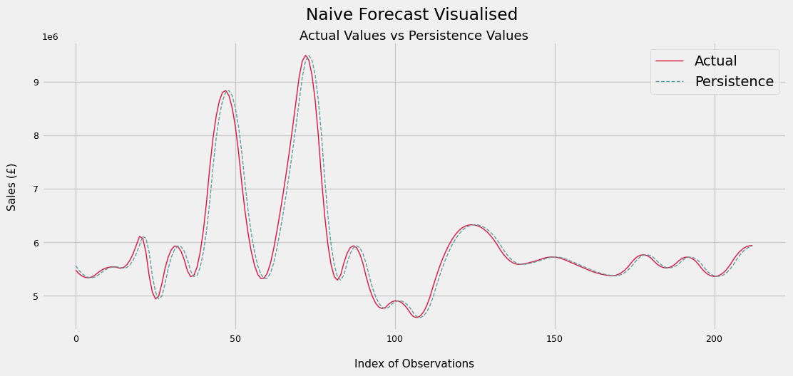
Below we can see a small sample of predicted vs actual values
for i in range(20):
    print('Predicted Value: £%.d | Actual Value: £%d' % (predictions[i], validation[i]))
Predicted Value: £5927130 | Actual Value: £5953795
Predicted Value: £5953795 | Actual Value: £5975201
Predicted Value: £5975201 | Actual Value: £5989949
Predicted Value: £5989949 | Actual Value: £5989640
Predicted Value: £5989640 | Actual Value: £5972872
Predicted Value: £5972872 | Actual Value: £5939646
Predicted Value: £5939646 | Actual Value: £5889961
Predicted Value: £5889961 | Actual Value: £5826909
Predicted Value: £5826909 | Actual Value: £5769028
Predicted Value: £5769028 | Actual Value: £5719410
Predicted Value: £5719410 | Actual Value: £5678053
Predicted Value: £5678053 | Actual Value: £5644958
Predicted Value: £5644958 | Actual Value: £5620126
Predicted Value: £5620126 | Actual Value: £5603555
Predicted Value: £5603555 | Actual Value: £5593979
Predicted Value: £5593979 | Actual Value: £5583791
Predicted Value: £5583791 | Actual Value: £5571725
Predicted Value: £5571725 | Actual Value: £5557781
Predicted Value: £5557781 | Actual Value: £5541958
Predicted Value: £5541958 | Actual Value: £5524256
The persistence forecast error is about £198k per day. As a % of the mean sales over the time period, we see that it is only around a 3% error
Still, this is the target to beat for our model and predictions
rmse / np.mean(dataset)
0.034404241504500443
6) Testing for Stationarity + Exploring Auto- and Partial Autocorrelation
We use the Augmented Dickey-Fuller test to check if our dataset is stationary. This condition is necessary for our ARIMA model to perform well. If the series is non-stationary, we may need to perform differencing on it by subtracting obs(t-1) from obs(t).
The null hypothesis for this test is that the series has unit root, and therefore is non-stationary
We see below that the test statistic is very extreme and the p-value is 0. Hence, we reject the null hypothesis - this series is stationary.
result = adfuller(dataset)
print('ADF Test Statistic: %.3f' % result[0])
print('p-value: %.3f' % result[1])
ADF Test Statistic: -4.974
p-value: 0.000
7) Manually configured ARIMA
Let’s manually configure an ARIMA model, which requies an input of 3 parameters:
- p: the number of lag observations included in the model
- d: the number of times the raw observations are differenced
- q: the size of the moving average window
We already know that d = 0 is a good value to start from given that the findings of section 6. By Autocorrelation and Partial Autocorrelation Plots of the data, we can find suitable values for p and q, respectively.
7.1) Autocorrelation Plot
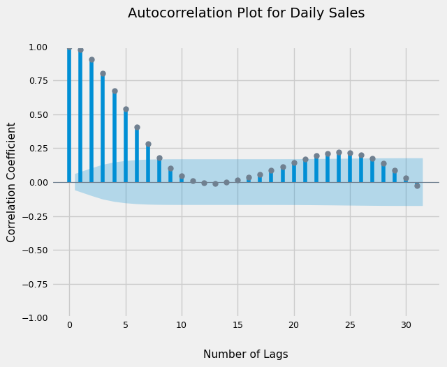
From the graph below, we see that correlations with up to 7 lagged values are significant. So we can start with value of 7 for the ‘p’ or Autoregression parameter
plot_acf(dataset);
7.2) Partial Autocorrelation Plot
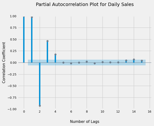
Additionally, the PACF suggests we can use a value of 4 for the ‘q’ or Moving Average parameter
plot_pacf(dataset, lags = 15, method = 'ywm');
7.3) Train and evaluate ARIMA
To fit and evaluate our ARIMA model, we need to execute the same method of walk forward validation as we did with the persistence model. That is to say, we will:
- train the model on the entire training set
- make a 1-step prediction
- compare the actual value from validation set at actual(t), to predicted(t)
- add the actual(t) value of the validation set to the training set
- retrain the model on the training set and repeat, until we have come to the end of the validation set
Through trial and error, I have found that large ARIMA values (like 7) result in a Convergence Error. If we reduce the number of lagged values to be included, we overcome this.
history = [x for x in train]
predictions = []

for i in range(len(validation)):
    model = ARIMA(history, order = (3, 0, 4))
    model_fit = model.fit()
    yhat = model_fit.forecast()[0] # one step prediction
    predictions.append(yhat)
    latest_obs = validation[i]
    history.append(latest_obs)
rmse = np.sqrt(mean_squared_error(validation, predictions))
print('RMSE for ARIMA Model is £%.2f in Sales per Day' % rmse)
RMSE for ARIMA Model is £34899.79 in Sales per Day
for i in range(20):
    print('Predicted Value: £%.d | Actual Value: £%d' % (predictions[i], validation[i]))
Predicted Value: £5469507 | Actual Value: £5473522
Predicted Value: £5405513 | Actual Value: £5408708
Predicted Value: £5372737 | Actual Value: £5363526
Predicted Value: £5340838 | Actual Value: £5337975
Predicted Value: £5335498 | Actual Value: £5332057
Predicted Value: £5343497 | Actual Value: £5345770
Predicted Value: £5376484 | Actual Value: £5379115
Predicted Value: £5427943 | Actual Value: £5428317
Predicted Value: £5486079 | Actual Value: £5470724
Predicted Value: £5503206 | Actual Value: £5502562
Predicted Value: £5528979 | Actual Value: £5523829
Predicted Value: £5538888 | Actual Value: £5534527
Predicted Value: £5540881 | Actual Value: £5534655
Predicted Value: £5532993 | Actual Value: £5524214
Predicted Value: £5510642 | Actual Value: £5509009
Predicted Value: £5498158 | Actual Value: £5523883
Predicted Value: £5568361 | Actual Value: £5574642
Predicted Value: £5643606 | Actual Value: £5661287
Predicted Value: £5764066 | Actual Value: £5783817
Predicted Value: £5914683 | Actual Value: £5942233
plt.figure(figsize = (12, 5))
plt.plot([x for x in validation],
          linewidth = 2,
          color = 'green',
          label = 'Actual')

plt.plot([x for x in predictions],
          linewidth = 1.7,
          color = 'red',
          linestyle = '--',
          label = 'Predicted')

plt.suptitle('ARIMA(3, 0, 4) vs Actual Data', x = 0.5125)
plt.xlabel('Index of Observations', size = 11, labelpad = 15)
plt.ylabel('Sales (£)', size = 11, labelpad = 15)
plt.legend()
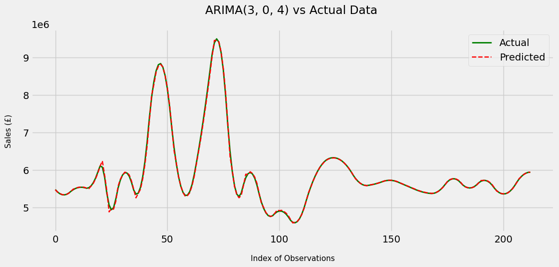
Wow, we were able to drastically reduce the RMSE compared to the persistence forecast model. In fact, it is a (34899.797 - 197929.88)/197929.88 = 82% reduction in RMSE. Visually, the model performs extremely well and is able to mimic the actual data quite closely.
In fact, the model feels like it’s performing too well, which makes me very suspicious - I am sceptical that the model is actually this skilled. Luckily, this is exactly what our test set is for; later on, we’ll see if the model performs as well or near enough on data it has never seen previously.
But before that, we have two more steps to complete. We can i) try and make the model performance on the validation set even better and ii) look at the residuals of the above model to learn more about the errors it’s making and whether we can use that information for our benefit
Let’s tackle point i) first. Above, I manually configured the ARIMA model to be used. We can now take a more analytical approach and perform Grid Search to find the optimal values for p, d and q
8) Grid Search for ARIMA Parameters
I will wrap my ARIMA code in a function and define another function that performs grid search, calling the former function inside the latter.
Unfortunately in practice, while testing this out, my personal machine did not seem suited to running the function as it was running for over an hour without finishing the required loops. However, I am certain that with more computational resources, we could improve the performance of our model even further.
So let’s view what the implementation of Grid Search would look like (without actually implementing it) before moving onto investigating residuals
import warnings

# define ARIMA evaluation function to be called in evaluate_models function
def evaluate_arima_model(X, arima_order):

    train_size = int(len(X) * 0.80)
    train, validation = X[0:train_size], X[train_size:]

    history = [x for x in train]
    predictions = list()

    for t in range(len(validation)):
        model = ARIMA(history, order = arima_order)
        model_fit = model.fit()
        yhat = model_fit.forecast()[0]
        predictions.append(yhat)
        history.append(validation[t])

    rmse = sqrt(mean_squared_error(validation, predictions))
    return rmse

# define evaluate_models function - this is the gridsearch function

def evaluate_models(dataset, p_val, d_val, q_val):
    best_score, best_config = float("inf"), None
    for p in p_val:
        for d in d_val:
            for q in q_val:
                order = (p, d, q)
                try:
                    rmse = evaluate_arima_model(dataset, order) #dataset has to be a Series
                    if rmse < best_score:
                        best_score, best_config = rmse, order
                    print('ARIMA%s RMSE=%.3f' % (order,rmse))
                except:
                    continue
    print('Best ARIMA%s RMSE = %.3f' % (best_config, best_score))

# to call these functions, first define the ranges of p, d and q you want to iterate through

p_values = range(0, 6)
d_values = range(0, 1)
q_values = range(0, 5)
warnings.filterwarnings("ignore")

# call one function inside the other.
# evaluate_models(X, p_values, d_values, q_values)
9) Investigating Residuals
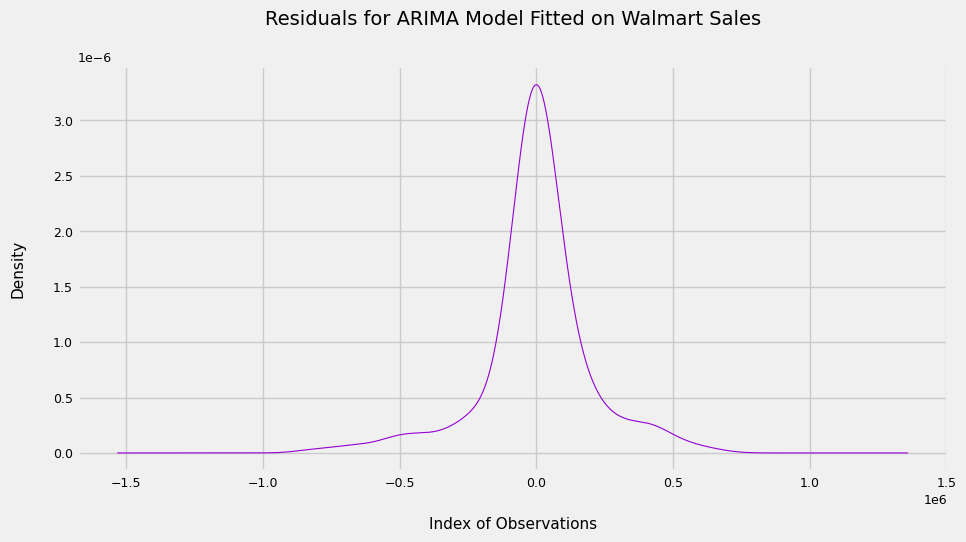
Coming on to point ii), below is a plot of the residuals.
residuals = [validation[i] - predictions[i] for i in range(len(validation))]

pd.Series(residuals).plot(kind = 'kde',
                          linewidth = 0.8,
                          figsize = (10, 5),
                          color = 'darkviolet');

plt.xlabel('Index of Observations',
           size = 11,
           labelpad = 20)
plt.ylabel('Density',
           size = 11,
           labelpad = 20)

plt.title('Residuals for ARIMA Model Fitted on Walmart Sales',
          size = 14,
          pad = 30)

np.mean(residuals)
1775.9785734153847
We see that the plot is too pointy to be Gaussian, and that the mean is quite far from 0, suggesting the model is still not capturing all of the signal from the data.
I suspect a large part of this is because of the extreme outliers we saw in December months. Perhaps we can account for these explicitly in the model by adding an estimate to sales in December for our December predictions And that’s it! Now we can use our ARIMA model to forecast sales for any given day of the week and, even better, update it with data as more of it becomes available. This will lead to better performance in the long run.
Finally, let’s see how well the model does on the unseen test set
10) Final evaluation on Test Set
history = [x for x in dataset]
predictions = []

for i in range(len(test)):
    model = ARIMA(history, order = (3, 0, 4))
    model_fit = model.fit()
    yhat = model_fit.forecast()[0]
    predictions.append(yhat)
    latest_obs = test[i]
    history.append(latest_obs)

rmse = np.sqrt(mean_squared_error(test, predictions))
print('RMSE for ARIMA Model is £%.2f in Sales per Day' % rmse)


plt.plot([x for x in dataset[:100]], # last 100 obs of training data
          linewidth = 2,
          color = 'crimson',
          label = 'Training Set')

plt.plot([None for x in dataset[:100]] + [x for x in test],
          linewidth = 1.7,
          color = 'green',
          label = 'Test Set - Actual')

plt.plot([None for x in dataset[:100]] + [x for x in predictions],
          linewidth = 1.3,
          color = 'slateblue',
          linestyle = '--',
          label = 'Test Set - Predicted')


plt.suptitle('ARIMA(3, 0, 4) Final Evaluation vs Test Set', x = 0.5125)
plt.xlabel('Index of Observations', size = 11, labelpad = 15)
plt.ylabel('Sales (£)', size = 11, labelpad = 15)
plt.legend()
RMSE for ARIMA Model is £12850.26 in Sales per Day
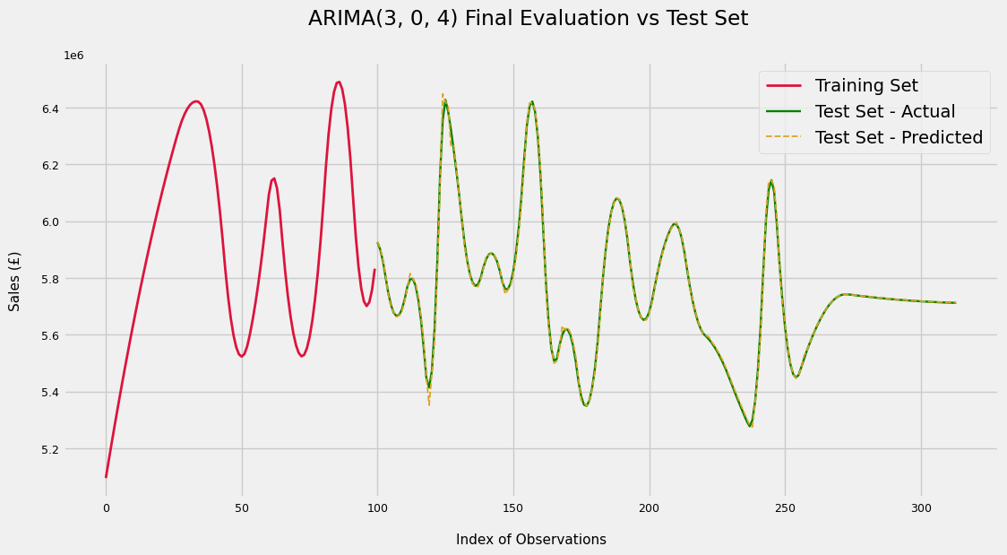
On the test set, the model performs very well; a ((12850 - 197929) / 197929) * 100 = 93% reduction in error from the persistence forecast.
And that’s it! Now we can use our ARIMA model to forecast sales for any given day of the week and, even better, update it with data as more of it becomes available. This will lead to better performance in the long run.

